Dubai Harbour
Redesigning a maritime district's digital identity
Redesigning a maritime district's digital identity
Dubai Harbour is a seafront district developed and curated by Shamal Holding, positioned between Palm Jumeirah and Bluewaters Island. Home to the region's largest marina, a major cruise terminal, hotels, dining, retail, and the newly launched Dubai Harbour Residences, it is one of Dubai's most ambitious waterfront destinations.
Built around Dubai's relationship with the sea, the district serves everyone from superyacht owners and cruise passengers to residents and lifestyle visitors. Its most recent chapter, a limited collection of beachfront apartments and penthouses targeting high-net-worth buyers, marks its evolution from maritime infrastructure into a complete coastal lifestyle address.
By the time Digital of Things was engaged, Dubai Harbour had the physical substance to compete with the world's leading waterfront destinations. What it lacked was a digital presence worthy of that ambition.
Dubai Harbour was already extraordinary on the ground. The region's largest marina, a world-class cruise terminal, a growing promenade of dining and retail, and residential towers targeting high-net-worth buyers. On paper, a destination. Online, a different story.
The existing website served a narrow audience: captains, berth holders, and logistics-minded visitors looking for technical information. It was functional. It was not aspirational. And for Shamal Holding, who were in the process of repositioning Dubai Harbour as a premium lifestyle district, that gap was becoming a commercial problem.
DOT was brought in to close it. Not just with better visuals, but with a digital experience that could carry the weight of the brand's ambition, speak to multiple audiences without alienating any of them, and support the imminent launch of Dubai Harbour Residences.
Phase 1: Discovery and Insight
We started where most agencies skip: the existing evidence. We looked at previous customer research, existing brand guidelines, and site analytics to understand what the current experience was actually doing, and for whom.

We ran stakeholder workshops to align on what success looked like, then layered in SEO and competitive research to pressure-test our structural thinking against global benchmarks. This gave us a content strategy grounded in both business objectives and search intent before a single layout was sketched.
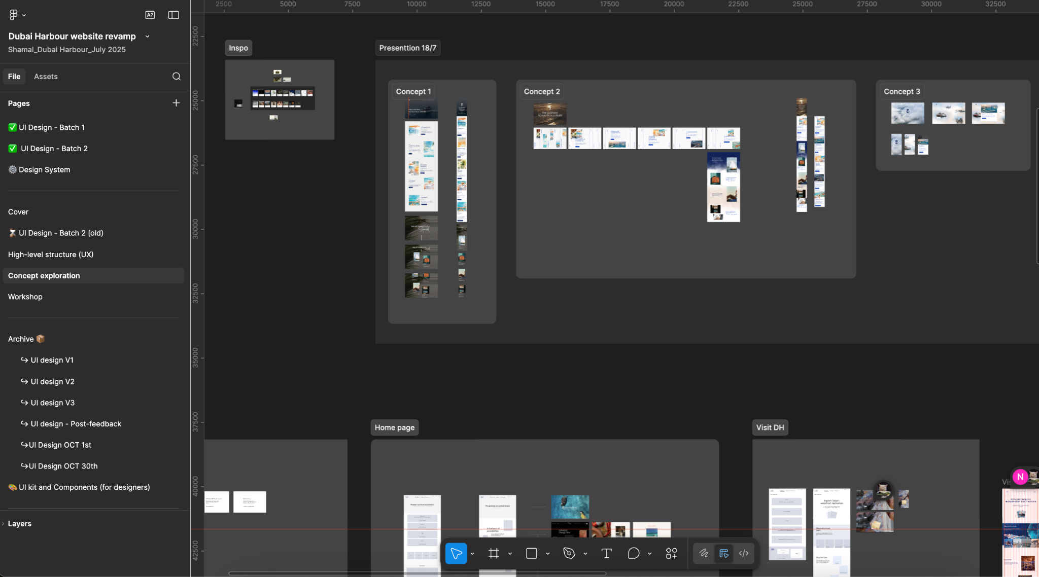
Phase 2: Strategic Design
Rather than opening with visual concepts, we built content models first. Defining the components, the hierarchy, and the storytelling logic before settling on aesthetics meant that every visual decision that followed had a strategic reason behind it.
From multiple design directions, we landed on a "fluid luxury" aesthetic: asymmetric layouts, nautical textures, and a warm palette that drew from the sensibility of the French Riviera. The tone of voice followed the same logic. High-end copy and micro-copy were written to feel sophisticated without being cold, and every call to action was crafted to feel like an invitation rather than an instruction.
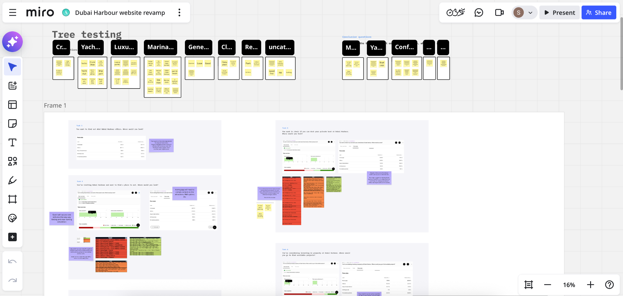
Phase 3: Validation with UserQ
Before finalising the information architecture, we ran Tree Testing with real users in the region using UserQ. This meant our structural decisions were validated against actual behaviour, not internal assumptions.
The testing confirmed that key navigation labels, including "Marinas" and "Seafront Living," worked intuitively across different user personas. It also surfaced the places where users expected to find content that was only available in one section. We addressed this by making essential information accessible from multiple entry points, reducing friction for visitors who approach the site from different angles.
The new Dubai Harbour website launched as the district's first digital presence that matched its physical ambition. Several outcomes followed.
✓ A unified brand identity. The site now reflects the same standard as the Yacht Club, the promenade, and the Residences. For the first time, a visitor's first digital impression of Dubai Harbour prepares them for what they will find when they arrive.
✓ Journeys that work for everyone. The site successfully serves B2B users, including marina operators and captains who need technical specifics, alongside B2C visitors looking for dining, events, and lifestyle experiences. Neither audience has to wade through content meant for the other.
✓ Faster stakeholder alignment. The structured, component-by-component design process gave the Shamal marketing team a clear framework for decision-making. What had previously been open to interpretation became a defined visual and content language, one that now extends across their broader digital strategy.
✓ A commercial platform for the Residences launch. The new UX gave Dubai Harbour Residences a credible, high-end digital home from day one, appropriate for an audience considering multi-million dirham waterfront properties.

The site is now live. Explore Dubai Harbour's new digital experience at dubaiharbour.com
 UAE: 1507, The Dome Tower, Cluster N, JLT, Dubai, UAE
© 2026 Digital of Things DMCC. All rights reserved | Privacy policy